In what ways does your media product use, develop or challenge forms and conventions of real media products?
Friday, 24 February 2017
QUESTION 1 - VLOG
In what ways does your media product use, develop or challenge forms and conventions of real media products?
Thursday, 23 February 2017
PLANNING MY EVALUATION
In my evaluation, as explained, I need to answer these three questions:
- In what ways does your media product use, develop or challenge forms and conventions of real media products?
- How does your media product represent particular social groups?
- What kind of media institution might distribute your media product and why?
- Who would be the audience for your media product?
- How did you attract/address your audience?
- What have you learnt about technologies from the process of constructing this product?
- Looking back at your preliminary task, what do you feel you have learnt in the progression from it to the full product?
I am going to present my answers all in video format. Each video will have a different format whether it is a vlog or a documentary.
In what ways does your media product use, develop or challenge forms and conventions of real media products?
I am going to present this as a sit down, talking video. I probably will find somebody my age to speak to about the magazine and if they think it is similar to any other magazines.
How does your media product represent particular social groups?
This video will be speaking to a camera whilst using on screen annotations and images.
What kind of media institution might distribute your media product and why?
This will be a voice over text where I compare different institutions.
Who would be the audience for your media product?
This video will be speaking to a camera whilst using on screen annotations and images.
How did you attract/address your audience?
I will be speaking to camera with on screen annotations and images. I will also include an interview on a friend
What have you learnt about technologies from the process of constructing this product?
This video will be a voiceover with text.
Looking back at your preliminary task, what do you feel you have learnt in the progression from it to the full product?
This video will be speaking to a camera whilst using on screen annotations and images.
FINAL PRODUCT


Comparing them side by side, I can clearly see a house style developing in my magazine.
Now I must begin the conclusion which I aim to present in a video format.
DOUBLE PAGE SPREAD ARTICLE
After planning the layout of the double page spread, I needed content for the article. I decided to include content that was non-fiction due to the main reason that the narrative will seem more natural to read. By including an actual interview with legitimate information, the subtle punk ideologies of the band can be subliminally conveyed through the words they use and the content they provide. This means that anyone reading the article will be able to further immerse themselves in the article as they may relate to the content.
I interviewed Leo, the lead singer of the band. I asked him various questions whilst I noted down his responses after looking at the video.


Overall, I am extremely happy with how all the text turned out. I feel that there is a natural story and the content has a strong link to the target audience.
For the content, I used a basic font commonly used in magazines so the information is clear and formal. I also used a large letter 'L' at the start to conform to the forms and conventions of any article. I also used paragraphs to order my text to make it less overwhelming. This is also achieved by the use of columns. I left a space in between two paragraphs for a picture to break up the text and to keep it interesting for the younger reader. For the Q&A, I used the font 'Bebas' for the questions so they stand out over the answers to the questions. After adding the text to the page. I finished the front cover by adding extra photos and text to occupy the empty spaces on the page.
On the left, I included the EP cover with the words 'OUT NOW' in captials on it to further promote their new song. I also included a QR code next to it to send them straight to the song. I decided to place these here as they would be easily located by the reader. I decided to place two photos on the page instead of one as planned. This is because I had extra room to fill in due to the movement of the text. I used two photos of the band that conveyed them as relaxed and chilled. I chose these photos to further portray the article as laid back and relaxed. I then added the page numbers at the bottom of the page so they would not interfere with the narrative. I used a screenshot from their music video in the space between the text to give the reader a taste of what the video is like. I also used a quote from the Q&A to further influence the reader to read the article.

I interviewed Leo, the lead singer of the band. I asked him various questions whilst I noted down his responses after looking at the video.

The content he provided with me turned out great and I noticed the language he used and the way he acted linked in to my research in to the genre.
After the interview, I added the information he provided me on photo shop.


Overall, I am extremely happy with how all the text turned out. I feel that there is a natural story and the content has a strong link to the target audience.
For the content, I used a basic font commonly used in magazines so the information is clear and formal. I also used a large letter 'L' at the start to conform to the forms and conventions of any article. I also used paragraphs to order my text to make it less overwhelming. This is also achieved by the use of columns. I left a space in between two paragraphs for a picture to break up the text and to keep it interesting for the younger reader. For the Q&A, I used the font 'Bebas' for the questions so they stand out over the answers to the questions. After adding the text to the page. I finished the front cover by adding extra photos and text to occupy the empty spaces on the page.
On the left, I included the EP cover with the words 'OUT NOW' in captials on it to further promote their new song. I also included a QR code next to it to send them straight to the song. I decided to place these here as they would be easily located by the reader. I decided to place two photos on the page instead of one as planned. This is because I had extra room to fill in due to the movement of the text. I used two photos of the band that conveyed them as relaxed and chilled. I chose these photos to further portray the article as laid back and relaxed. I then added the page numbers at the bottom of the page so they would not interfere with the narrative. I used a screenshot from their music video in the space between the text to give the reader a taste of what the video is like. I also used a quote from the Q&A to further influence the reader to read the article.

DOUBLE PAGE SPREAD PRODUCTION

Firstly, I researched the dimensions for the double page spread and created a new project. I firstly cropped the image to include each of the three members. I then used the eraser tool to make the picture fade in to the white background.


After finally deciding the layout of the image, I added text. However, I could not decide between two colours. One of the colours was a gradient fading from orange to turquoise whilst the other was purple with a dark, satin overlay. I couldn't decide for various reasons. I thought that the orange and turquoise gradient connoted a beach which links in to the name of the sub-genre. However, the purple colour relates to the song they had released called 'Purple Stripes'. In the end, I decided to choose the purple font colour as it seemed to stand out more due to the fact that it is is slightly lighter and the purple contrasts the black outline further pulling the readers attention to the title.
I decided to call the article, 'Beach Punk Bathroom Antics' as I feel that the words work together due to the alliteration of 'B'. The title also reinforces the mise en scene of the picture in how they are positioned in and around a bathtub.
For the stand first, I wrote 'What's more punk than a music video in a bath tub?' I decided to use a rhetorical question to further promote the video and encourage the reader to watch it due. I also decided to use this as the stand first as a music video in a bath tub is rather unique and this stand first makes the article stand out among the others.

After analysing my draft, I decided to change the location of the text boxes. This is because, I wanted the natural divide in the page to include the text on one side and the title and pictures on another. Also by placing the boxes here, the punk mise en scene is still visible e.g. the black nails. I decided to lower the opacity of the white boxes for different reasons despite the fact that the black font doesn't stand out as much. Having a solid colour as the background here conceals the picture behind it and then, I feel there will be too much white on the page. Too much of one colour can get too overwhelming, especially for young adults and children who listen to punk.
Friday, 17 February 2017
CONTENTS PAGE PRODUCTION 2

After slightly altering my designs, I moved on to finalising my contents page. I firstly decided to ignore my draft and include some text reading 'CONTENTS' as on second thoughts, this would fully establish the page as a contents page and as I decided to move some of the articles on top of the pictures, I needed to take up some more room on the page. For both 'CONTENTS' and 'EXTRAS', I used a yellow font with a red outline. This choice was influenced due to the fact that I used these two colours on my front cover. This repetition of colours further the fiery music the artists produce.

I then added the content to the page. I made sure to use the same font and size for each article title, additional information and page number to make sure that the magazine is consistent. For the article title, I chose a black bold font so that it is easier for the reader to locate the desired article. I made the page number easily recognised by using a large white font. I made the layout identical to the layout of the content on top of the pictures to add to the house style of the page. The only two differences are the black font instead of white, to stand out against the background and the fact that the text is straight and not slanted to add formality to the articles.
I decided to again, use gold as a colour for the various puffs saying 'GOSSIP' etc to highlight how the article is special compared to the others, encouraging them to read the page. I purposely used different sizes and shapes for the red strokes. The main reason I decided to alternate the sizes is to keep the content interesting and less repetitive as the youthful reader may be overwhelmed at the heavy use of black text. For the text, I made sure to use appropriate language that the audience would be used to like 'BAD*SS' and 'BIIIIIIIIIIG'. I also made sure to keep the additional information short and snappy as this way, the reader would have to turn to the article to find out more. Also, too much information could overwhelm the reader preventing them from reading on.

After removing some of the articles and placing them on the pictures, I had a small space at the bottom of the page to fill in. As I decided to remove the photos from the picture at the top left, I decided that it would be appropriate to move them to the bottom right. I feel that this choice was strong as the photos break up the content and keep it engaging and vibrant.
Monday, 13 February 2017
ENCOUNTERING PROBLEMS WITH THE CONTENTS
When I sat back and looked at the contents page, I felt that it was not right. This is because I felt that the layout did not convey the forms and conventions of the conventions of a regular music magazine. To overcome this problem, I decided to look back at my older posts on the contents page. I realised that I needed to keep it simple in my design and focus less on having boxes for my text. A good example of a contents page is this-

I feel that this example is much stronger than my contents page. The main visible differences that makes it seem more professional/ punk like is the use of fonts and layout. For my contents page, the block colours and the use of white text boxes makes it look almost like a comic strip. I also feel that the red puff is too childish and has no relevance to the punk genre. From looking at my contents page, I feel as if it has the forms and conventions of a pop magazine rather than a punk magazine.
To change this, I have decided to focus on the layout, colours and font as I feel that these are the key components that make this example of a contents page, Punk.
I decided to keep the layout of the top of the magazine as I felt that this accurately conveyed the forms and conventions of the genre.

To start off, I decided to remove the white text box and the red puff. Immediately after removing these, it lost the comic strip look. I then wanted to add text. I decided to use a gold font colour as this stood out from the picture behind and also emphasised the importance of the picture. I decided to use 'Dreamwalker' as the font for the title of the article as compared to the last font, it had greater punk connotations with the bold effect and the distorted text. I also decided that it was appropriate to place the text on a slant to create a sense of informality and to make it interesting to look at. For the information under the article title, I decided that it was a better idea to include it under the title. To make it stand out, I used a white font with a black outline. Instead of having a red puff, I decided to include instead a red stroke of paint. This made the contents look much less overwhelming and accurately conveyed the forms and conventions of the genre due to the fact that it is messy and unique.

I feel that these small changes made the contents page seem much more professional with deeper links to the punk genre.

I feel that this example is much stronger than my contents page. The main visible differences that makes it seem more professional/ punk like is the use of fonts and layout. For my contents page, the block colours and the use of white text boxes makes it look almost like a comic strip. I also feel that the red puff is too childish and has no relevance to the punk genre. From looking at my contents page, I feel as if it has the forms and conventions of a pop magazine rather than a punk magazine.
To change this, I have decided to focus on the layout, colours and font as I feel that these are the key components that make this example of a contents page, Punk.
I decided to keep the layout of the top of the magazine as I felt that this accurately conveyed the forms and conventions of the genre.

To start off, I decided to remove the white text box and the red puff. Immediately after removing these, it lost the comic strip look. I then wanted to add text. I decided to use a gold font colour as this stood out from the picture behind and also emphasised the importance of the picture. I decided to use 'Dreamwalker' as the font for the title of the article as compared to the last font, it had greater punk connotations with the bold effect and the distorted text. I also decided that it was appropriate to place the text on a slant to create a sense of informality and to make it interesting to look at. For the information under the article title, I decided that it was a better idea to include it under the title. To make it stand out, I used a white font with a black outline. Instead of having a red puff, I decided to include instead a red stroke of paint. This made the contents look much less overwhelming and accurately conveyed the forms and conventions of the genre due to the fact that it is messy and unique.


I feel that these small changes made the contents page seem much more professional with deeper links to the punk genre.
Sunday, 12 February 2017
CONTENTS PAGE PRODUCTION 1

I began by applying a background. Instead of going for a white background, I decided that I would instead go for a rough, paper like texture. I decided this for various reasons. The main reason I chose this over a plain background is because the rough look connotes the genre in itself. It also will contrast the white text better so the text stands out more.

I then began to add shapes and boxes that I planned in my draft. The reason I chose black as the colour of the boxes is due to the fact that it contrasts the background and therefore the text and images layered on top seem to stand out more. I added a slight shadow to the large black box as it further emphasised the importance of the information located in it. I again decided to slightly place the box at the top of the page on a tilt as I felt that the contrast between the other box, further emphasises the informality of the magazine content. I also added a slight gradient in this box to add depth. I then added the puff at the top right. I decided to use gold as the colour here to connote importance. I added shadows and strokes to create the illusion that the gold was solid. By adding these effects, the gold seems to be as if it is real gold which further connotes the importance of the text. I also decided to add a white outline as this further frames the shape and throws emphasis on the text inside.

I then began to add text to the top of the page. I used the same font as the mast head for the 'PUNK OFF!' to emphasise a house style. I decided yo use the font 'Old Press' for the 'EXCLUSIVE CONTENT' as it is rather bold but at the same time, the eroded look is rather punk like. I decided to increase the size of 'EXCLUSIVE' to throw emphasis on the fact that the articles in the magazine are special. I decided to add a splat effect in the far right of the black shape as I feel that this relates to the informality and overall youthfulness feel of the magazine. This is because a splat is commonly associated with punk as they both are regarded as 'all over the place'. I feel that the addition of this image slightly faded in to the black background was a good addition as it fills in the blank space and also has punk connotations.

I then began to add the chosen photos. I decided against using photos for the posters due to the fact that the placement meant that the band would be concealed. I carefully cropped each photo so that each model was in the middle of the photo. I then added three, red, cropped puffs with a black outline on each photo. I decided to use the colour red as it again, is a very vibrant colour and stands out. I have also used the colour in my front cover. The repetition of the colour conforms to the house style of my magazine. I then added three white text boxes where I would place my article title.

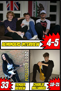
I then began to add text. Inside the puffs, I decided to use a white font as these colours contrast. It is extremely important for the page numbers to stand out as the contents page's main purpose is to help locate the correct page for each article. For the article titles, I decided to use the same font as the feature article cover line. I also used the same colour. I decided to do this as by having a repeated theme of fonts and colours throughout, makes pages easier to locate and makes it so the reader is familiar with the format of the magazines. I decided to outline the text in black as it contrasts the white box. I also decided to use a gold to silver gradient for the '2017 EDITION' as again, these colours explain that the guitar is new and expensive. I used a different font for this to make the content interesting.
Wednesday, 8 February 2017
ADVERTISMENT
 I feel that advertisement is extremely important in any print media production. Along with the price of the magazine, adverts are vital to the profits of the magazine. This is why I have decided to write a blog about it. In my contents page, I have left out page numbers. In these pages, I hope to include page long adverts that directly link to the research I carried out. An example of a page long advert found in a magazine is the 'GIVENCHY' fragrance.
I can greatly increase my profits by using advertisment. I feel that accurately planning what adverts to include is important as if the advert is appealing to the reader, the company providing the advert is more likely to gain more customers. With more customers, they are more likely to contact the magazine again and ask for the advert to feature in the next issue or the website for example.
After considering my research results below, I created a list of possible adverts and the reasons behind the choices.
'The age group will be focused around 16-25 year old people with a psychometric rating of C-D. I also feel that I will center the narrative to represent the key beliefs of succeeders and reformers as these were the two most popular results in my research'
- New Albums
New albums are important in any music magazine and these albums will have a great chance of creating ad impressions and therefore making them worth including.
- Alcohol (Jagermeister/Carling)
Alcohol is common within the C-D bracket and 18+ year olds. I feel that including alcohol adverts will appeal to this age group and urge them to purchase the brand the next time they drink. Punk followers are stereotyped to drink so this is another reason why I think including this is appropriate. This also links in to the reformer category due to the fact that for the younger generation, drinking alcohol is seen as very punk like and rebellious.
- Festivals
Similar to new albums, festivals and gigs are expected in music magazines and appeal to the whole audience.
- Clothing (Doc Martens/Fred Perry)
Clothing appeals to the C-D bracket as wearing the same clothes as famous people, momentarily takes them away from the working class and makes the reader feel as if they are like the celebrity.
- Punk Shop (All Ages Records)
All Ages Records is a punk shop in London. I decided to include this as if the reader is travelling to London/lives there, they can visit the shop. The shop is extremely popular and due to the fact that most people know it, the advert has the potential to make an impression on the audience.
Subscribe to:
Comments (Atom)