Sunday, 8 January 2017

FRONT COVER PHOTOS

After the planning of my mast head photos, I was able to go out and take the images for my magazine. I was extremely impressed with how they came out. As planned, I took these photos in the bathroom.


This photo of the band is in portrait. Which is the correct layout for every magazine front cover. I am really pleased with this photo in particular as I feel that it would fit within a punk magazine due to the content it showcases. The clothing is rather extravagant with purple stripes, pink. green, red and other colours all present. The array of colours connotes the idea of the punk genre being controversial and different to mainstream music. The clothes they are wearing are normal clothes like jumpers and baseball caps. As explained by Rob, the person I interviewed, the majority of the punk audience wear casual, mainstream clothes with small links to the stereotypical punk clothing. Examples of stereotypical punk clothing would be the black nails in this example. I feel that the subtle contrast of casual and punk clothing in the mise en scene will have a greater impact on the reader as the chance that they would wear similar clothing, increases. After analysing many punk magazines. The clothing is also similar to what a teenager would wear. This is important as my target audience is around this age. I realised that the photos are all in direct gaze so that the reader feels that they have a connection with the artist. Because of this, I decided to use the idea of direct gaze in my photo. I used fill lighting in the form of a DSLR Speed-light so that the lighting would create subtle shadows. The shadows behind the band could connote the music and the controversial ideologies conveyed through the bad language and controversial lyrics. The use of artificial lighting also has the effect of highlighting the three boys. The fact that the middle member of the band is the lead singer also conforms with the majority of front cover photos as usually, the lead singer is in the middle. The audience will be familiar with this format and understand that the person in the middle is the lead. The photo also has a vignette effect around the borders which frames the band with an orb of shadow and draws the attention to the band members. Another positive of the photo is the fact that there is enough space above them to add the mast head. The only real negative of the photo is the fact that there could be a bit more brightness to make the bright colours of the clothing stand out more. Despite this, it can be easily fixed on an editing software such as PhotoShop. Due to all these factors, I have decided to use this photo as my main front cover image. Here are some other photos I took and I will explain why I didn't choose them.


I decided against choosing this photo due to the weak use of proxemics as the band are too far apart. This means that I can include less content on the front cover as they take up more space and it also connotes that they are not as good friends compared with the other picture. Their facial expressions are also much more serious which denotes that they may be uninterested in the article. This idea of them 'not caring' conforms with the punk stereotype and is common in lots of punk magazines however I feel that in this circumstance, it does not have the same effect as the close-knit, happy band in the picture I chose.


I did not choose this as it is in landscape and the person on the right is not looking directly at the camera. This does not have the same effect as the other photos when they were all using a direct gaze because it seems as if he is uninterested.

Thursday, 5 January 2017

SECONDARY PHOTOS 1

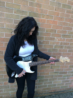
I decided to take some secondary photos to go on my contents page. These photos are going to be attached to a review of the 'new fender electric guitar'. I decided to use a female model as the majority of the punk audience is male. This means that it has the capability to attract the male gaze. The mise en scene of black and white clothing with black hair conveys stereotypical punk clothing and hairstyles. This again will be able to relate to the audience. I also like how the black and white guitar matches the clothing as it further contrasts the bricks behind and emphasising the model. Brick walls are common in punk photo shoots as they commonly portray the street vibe of punk and how it was popular on the streets before it broke out as a popular genre. Altogether, I am extremely pleased with how these pictures turned out.


This picture is  extremely effective due to the fact that she is laughing and smiling. Laughing and smiling show that she is enjoying life which can easily cause the reader to feel the same way. This however does not accurately convey the punk genre as most pictures are with a stern face. Despite this, I feel that this photo is appropriate to be used as she is in full shot along with the guitar and the angle is slanted which conveys the distorted idea of the punk genre compared to mainstream genres.


This photo is not cantered and is a level shot. She also has the guitar at her side instead. Positives of this shot is that she has her foot against the wall which connotes that she laid back and relaxed. The fact that the guitar is by her side is also good as it is more emphasised than the picture above as it does not blend in with her black/grey cardigan. Negatives are that it seems to be so laid back that it has no correlation to the key punk ideologies. The photo seems to have more of a link to the mainstream pop genre due to the angle, composition and facial expressions.


This picture is very similar to the first picture but the major difference is that she is looking down at the guitar and seemingly playing it. This has the effect of drawing the view of the reader to the guitar. However, I do not like the fact that you cannot see the face of the reviewer. This greatly decreases the potential impact of the photo and does not have the greatest connection with the audience.


From the brief analysis, I have chosen the first picture as it conveys a greater majority of punk ideologies.

PHOTO PREPERATION


I have decided to plan the shots I will take for the magazine. I feel that thoroughly planning the photo shoot will optimise the quality of the photos and the capability of drawing the audience in. For the front cover, I have decided to have a full band shot. This shot will be in the bathroom due to the fact that the lighting will highlight the band and the white walls will not take the view away from them. This is crucial in the front cover as all front covers have to convey the content of the magazine and encourage new readers to purchase it. After analysing many front covers, I like the way the band is conveyed in this 'Kerrang!' front cover. 


Due to this, I have decided to position the three members next to each other, in a mid shot with direct gaze at the camera as I feel that this has the best effect in attracting the audience.
For the contents page, I need a few pictures. Some that relate to the articles featured on the front cover and a few for the main cover line promoting the band. I have decided to include pages like reviews on guitars, band tours, interviews and other common things found in a punk magazine contents. Here is an example of a contents page, again from 'Kerrang!' I find most effective. 


Here we can see another picture of the band they focused the front cover on. Due to this, I will probably include another picture of the band. This picture will probably be a picture of them playing. I like the idea of a low angle shot as they are playing as it creates the feeling that the reader is the audience looking up and watching a live band play on stage. Placing this in the contents page will be ideal as the picture will be a mid-shot. For the double page spread, I am considering a longer shot so that I can fit more text in. I also have to include other photos of the other articles as presented in this contents. So I will take a picture of somebody holding an electric guitar and title the article something along the lines of 'GUITAR REVIEW'. This shot will probably be in a slanted, mid shot. The slant to emphasise the guitar and the mid-shot to get the guitar in the full shot. After analysing more magazine contents pages, I have decided to include another picture of a secondary band that I could have interviewed. This band will not be as popular as the band I use as the feature article. I have decided to take a picture of soloist sitting on a chair/ against a wall or standing up. I could title this article 'INTERVIEW WITH *INSERT BAND NAME HERE*' I feel again, a low angle shot will be good here as it has the ability to connote the idea that the soloist is maybe troubled and his thoughts will be featured in the article encouraging the audience to read the article.

Moving on to the double page spread, I have decided to use a single picture as the background. I have also decided to go with a shot of the band laying/standing against a wall. This is because the majority of the people I interviewed chose this image as their preferred pose.


This shot of the band connotes that they are down to earth and in the interview they are relaxed and are honest in what they are saying. I will also use direct contact in this photo again due to the reasons explained in previous blogs. I will probably include secondary pictures on the double page spread that I will take along with the main pictures. I will analyse my photo choices when I upload them to the blog.

Tuesday, 3 January 2017

PHOTO / CONTENT PREP

I am good friends with a member of a band called 'Reminders'. They are based on the Isle of Wight and they focus their music on the punk sub-genre of beach punk. I feel that utilising this for my magazine is vital and due to this, I can spend less time focusing on content and the mise en scene as the band will be able to provide me with the information I need on both of these key concepts within the magazine. It will also make it easier when it comes to collecting instruments as they already have the instruments ready to use. I have told them to wear what they normally do for a concert as the clothes they wear would be casual with some elements of the punk stereotype. The casual part is a key concept surrounding sub-genres like beach and surf punk. Examples of stereotypical clothing are boots and leather jackets.

I have also decided to take the pictures in various locations. The locations have been planned below


Location 1: BATHROOM
I have decided to take the main image in the bathroom due to four reasons. The bathroom along with the other locations are places where they shot their new music video, 'Purple Stripes'. If the reader has seen the music video, they will notice the mise en scene and link the picture to the video. This has the potential to attract new readers to the magazine. The bathroom has a simplistic design. This means that any photos taken will pull the readers view to the band. The white walls will almost act like a blank canvas. Another positive is the fact that the lighting in the bathroom is very good meaning I will not have to use artificial lighting for the photos. A bathroom is also commonly linked to playfulness. I researched that most people associate bathrooms with sexual acts and stupidity. This could be used to my advantage as the reader would link the band to being rather wacky and stupid which is a common representation  of most punk bands. The fact that they are playing a song in a bathroom, evokes the idea of the punk genre being 'unique' and the complete opposite of mainstream.

Location 2: PORCH
In the music video, the next shot is them in the porch. This is why I have chosen to take photos of them in this location. The photos from this location will probably be used in the contents page and the double page spread.

Location 3: SUMMER HOUSE
For the third location, they are going to be gigging inside their summer house. I feel that this setting will accurately portray the genre of beach punk due to the summer theme.

Now I have finished planning the photos, I can take them and decide which ones I will use in the magazine.


Tuesday, 27 December 2016

FONT TYPE FOR MAGAZINE MASTHEAD

Now, after choosing the masthead, I must choose a font. The font is one of the key features within the masthead and the boldness and style of it need to suit the genre and attract new readers.

I have collected all my fonts from www.dafont.com

I used the mastheads for Kerrang! and Vive le Rock in order to compare them and analyse similarities that relate to the punk genre:


FONT 1 - 'i tell you all my secrets'

This first font seems to have clear correspondance with the 'Kerrang!' mast head. The fact that it is shattered, distorted and rather bold, connotes the idea that the genre is uncontrollable and raw. I like the overall look of the font but if I were to use this, I would only use it for the masthead as it is not bery clear and will not attract the reader to the other information on the front cover.

FONT 2 - 'Chinese Rocks'


I feel that this font is a strong contender for the mast head due to the fact that the square, bold letters are easy to read meaning that the magazine will have the ability to pull the gaze of the readers to the mast head. Despite being rather straight, if you look closely, the typeface is slightly distorted which subtly connotes the punk genre as explained in the font above. 

FONT 3 - 'American Captain'


This font is one of the boldest which means that it has the potential to be the most visible. I feel that the simplicity and style of this font makes it a clean and usable one. However, the style of the font does not connote the punk genre. A font like this in my opinion would be used in mainstream pop magazines.

FONT 4 - 'Old Press'
This font is rather similar to font 1 due to the distorted theme on the typeface. However, This font is wider and seemingly more bold. I feel that this font would be appropriately used as the mast head due to it's clear relations to the 'Kerrang!' masthead. However, due to the fact that the letters are almost 'eroded', it looses the effect of being bold and does not stand out as much compared to other fonts alike font 3.

FONT 5 - 'Deadliner'
This font is both distorted and bold. The subtle use of distortion in the letters evoke the idea of the punk genre whilst it is easy to read due to the bold font and reasonably sized letters. I feel that this font has all the characteristics of the fonts above combined which is why I will use this for the masthead.


So after all the planning, I can now move on to the production of the magazine. 


BEGINNING OF THE MAGAZINE

After completing my research, I decided that the best place to begin was determining my magazine name. To decide the masthead name, I feel that I should take influence from other punk magazines. A strong example is 'Kerrang!' Features of this name is that it is onomatopoeic and sounds like a strum of an electric guitar. This directly relates to the key characteristics of the genre encouraging the audience to feel immersed in the narrative as it conveys the beliefs and values of the genre. Another example is 'Big Cheese'. The title immediately stands out due to the fact that it is rather irregular and does not directly associate to the punk genre. However, deep connotations of the name explain that it could highlight the craziness and individuality of the punk genre that the audience would pick up on and internalise. From this secondary research, I have formed three names to choose from:

The Pick
A plectrum is what is used to strum the strings of a guitar with. A common alternative to plectrum however is 'Pick'. The audience will understand this as it has strong links to key ideas within the genre. 'The Pick' also is a double entendre. It could also mean that the content is the best as it is 'the pick of the bunch'. This makes the audience feel as if the content is professional and created by people that share similar ideologies.

Sound of Hysteria
Green day used this lyric in one of their most popular songs, 'American Idiot'. This means that there is a large possibility that the audience will recognise the song quote and feel more immersed in the magazine. 'Hysteria' also is used as it conveys the ideologies of the punk audience as they commonly are stereotyped as being crazy and detached from a mainstream life.

Punk Off
'Punk Off' is a pun for 'F*** Off', a commonly used curse word used in anger. This means that the mast head will be direct address which is important when it comes to attracting audiences. This play on words is a use of humour and due to the fact that it denotes foul language, can be seen as controversial. Controversy is a key belief in the genre of punk and the music was extremely bad mannered and controversial back when it became a genre. Due to this, I feel that this mast head is a strong contender for being chosen.

I feel that after analysing all the names, 'Punk Off' will be the masthead as it is short, powerful and conveys all the appropriate ideas of the punk genre

Thursday, 22 December 2016

RESEARCH CONCLUSIONS - SECONDARY

After finishing my primary research, I decided to undergo some secondary research in to the punk genre. I decided to do this by using the internet.


From further research I found out that:
- Typical instruments in the genre are the electric guitar, bass and drums
- Controversial and modern when it first came out
- One of the most sub-genres in a genre
- Kerrang is the most popular punk magazine and even has a channel on TV
- It is stated that the typical american Punk wears a motorcycle jacket and jeans
- Was not until the mid 70's until it became a genre
- Typically fast paced music with three beats
- Not as common in the modern day youth


Now I have completed my research, I can finally move on to the production  of my magazine. From my research I have defined my target audience. The age group will be focused around 16-25 year old people with a psychometric rating of C-D. I also feel that I will center the narrative to represent the key beliefs of sucseeders and reformers as these were the two most popular results in my research.