Monday, 30 January 2017

FRONT COVER PRODUCTION

In this post, I will analyse the process I had to carry out to produce the final front cover. Throughout the process, I used my research to make the right decisions on what to include on the front cover.


I have already chosen my front cover image so all I had to do was scale it to my desired size. I purposely cropped the image so that it fits the three in the picture. I also kept in mind that the text would be behind them so I decided to leave around 1/5th of the background free above them.

-

It took me a while to edit the mast head due to the fact that I was debating if I should use a thin black outline or not. After experimenting, I decided that a black outline had more of an impact and stood out against the background more. I also was unsure of the spacing of text. I tried to space each letter around 2cm apart but I felt that it did not convey the key ideologies of the genre as well as if the text was closer together. This is because, if text is further apart, it begins to resemble a newspaper or a formal magazine.  Eventually, I decided to place the letters close together but not touching. This way, the text takes up more space making it easier to recognise if it was being sold. After researching various examples, I discovered that they all were placed similarly apart. In my research I discovered this photo on the right. From the position of the band members behind the text, I decided I would place the lead singer in front of the text with the two other members behind the text. I sketched this in my draft and when it came to editing, I strongly disliked the outcome. This is because it covered the expressions. I feel that the 'Kerrang!' example works due to the fact that the shot is a closer shot. This means that despite being covered by text, the facial expressions can still be seen clearly. Due to this, I decided against this and placed all the band members in front of the text.


I then moved on to my feature article cover line. I used my primary research to decide that it will be yellow and red. This is because the majority of the people that answered the questionnaire preferred the colour scheme of yellow. I wanted to lightly outline it so I decided to research what colour I should use. I experimented with a few colours like black, red and white and also experimented with the outline colour.


I eventually decided to use yellow as the font plainly due to the fact that it has the ability to stand out more against the dark background image. I also liked how the red outline had the ability to further add emphasis on the text due to the fact that it is a very contrasting colour. I chose this colour over the others as I felt that the harsh vibrancy of the yellow accurately conveys the fiery ideologies of the punk genre. Another reason why I chose the colour is due to the audience demographics. As my audience are teenagers, the bright colours have more of an impact compared to grayscale colours. The younger generation prefer brighter colours as they have been brought up with colour television and glossy magazines.

Here is a good article explaining the importance of colour in regards to marketisation:
http://ijbssnet.com/journals/Vol_3_No_22_Special_Issue_November_2012/2.pdf

I also had to choose a subheading. I decided to word mine, 'and their hottest, never before heard secrets'. I decided to name it this for multiple reasons. One reason is due to the fact that it states that in the interview, there will be 'never before heard secrets'. This is commonly used on front covers to entice the reader to read the interview as it unveils secrets on the band. I also decided to place the text in italics. I decided to do this as I felt that it becomes slightly less aesthetically pleasing to the eye. This device can therefore convey the genre as less mainstream which appeals to the wide audience as they prefer to be associated as a small subculture.


After looking at my draft, I felt that I needed to fill in the space above the feature article cover line. Eventually, I decided to use fire to fill in the space. I felt that it would be a good addition due to the fact that it directly links to the subheading saying 'hottest'. I feel that it is a good addition to the front cover and the placement is really effective in furthering the deeper meanings of the genre.

I decided to use a red background with white text for the 'limited edition' label. This is because it stands out. It is important to make this stand out as calling a magazine 'limited edition' increases the chance that the reader will purchase it. This is because the reader will think that the magazine is limited quantity or special over the other issues. This encourages them to purchase the issue.


The next step was adding and positioning the cover lines.I decided to place 2 on the right and 2 on the left. I also decided to have them on a slant. This is because if they were straight, it would connote formality and order. The fact they are on a slant is to emphasise that the interview is very informal and relaxed. 

I also decided to include a callout star as I feel that any information in here will be highlighted as important so therefore will direct the readers gaze to this.


I then added the desired text. I decided to have a cover line and then a sentence or two under explaining the article. I decided to use the font 'Old Press' for the cover line. I was considering to use this font for the masthead but I decided to use it for the cover lines as it is bold so it can draw attention to the text and it also is distorted and this, as explained in previous blogs, has strong references to the punk genre. I decided to have two coverlines featuring articles in the end. In my draft I planned to add more but when it came to the production I decided to reduce the number as there was not enough room on the cover. I decided to include 'Rancid' and 'Charlie Millward' due to the main reason that Rancid is one of the most popular bands right now and has a greater appeal to anyone considering purchasing the magazine. The 'Charlie Millward' article was chosen due to the fact that I had photos that could be included on the front cover. I wanted to include a secondary photo on the front cover to add a greater diversity on punk sub-genres regarding the mise-en scene in the attempt to try and attract a greater audience. 

I decided to use black text for the cover lines as it has a greater contrast with the white text box. However, I decided to use gold as the text colour of 'WIN' as the colour has a great association of winning and royalty. People will subconsciously internalise this idea and believe that the competition is special and they have the ability to win.

For the content of the cover lines, I had to keep it short, yet powerful encouraging the young audience with a short attention span to be encouraged to read further. For the Rancid section, I again decided to reference the fiery undertones of the genre. It also links to the word in the subheading and the fire. I worded the sentence as if the interview is relaxed. I managed to achieve this by using words like 'sit down' and 'chat', which connote an informal and chatty interview. I used similar devices in my 'Charlie Millward' cover line. However in this circumstance, I portrayed the informality of the interview using punctuation. I used an ellipsis and and an explanation mark. These are commonly used in text messages between the youth and are regarded as rather informal and chatty.

Here is the finished front cover. To finish it off, I had to include the small parts that make a magazine, a magazine. This is like the barcode, issue number, price, website and the date. I decided to place the issue number, date and the price at the top of the magazine to accurately convey the forms and convention of any magazine. Due to this placement, the reader will instinctively know where these important pieces of information are.

 I then set out to add the photos I planned to add. I decided to outline them in white to further highlight the pictures and for the photo of my model, I removed the background on PhotoShop as the background was blank and had no relevance to the mise en scene. I then added the logo of the Rebellion festival so that the reader has more of a chance to locate the competition as the logo would be familiar to them.

For the placement of the red strip containing text, I decided to ignore my draft and place it on a slant to further emphasise the informal tone of the magazine. For the text on the red banner, I decided to include the articles stated on my contents page and I decided to list them in importance. By listing them in importance, the first option has a greater chance of being read compared to the last. So I decided to list the content in order of what will appeal to the audience more. I also decided to elongate the letter 'O'  in 'SO' to emphasise the amount of content in the magazine. I decided to use red and white again as I feel that these  two colours have great impact.


Monday, 23 January 2017

DOUBLE PAGE SPREAD PLAN


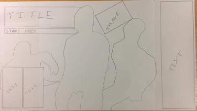
For my double page spread, I decided to keep the overall concept simple. This is because I want to emphasise the structure of the photo. From my primary research, I discovered that the majority of the people prefered the simplistic design so this is another reason why I opted for this approach. I really like the placement of the text as I am considering to include any additional information in the two smaller text boxes and I will feature the Q&A in the larger text box to the side. Whilst sketching the double page spread plan, I realised that I need more space to add text. Therefore, I have decided to merge the right hand side of the photo with a white background to create more space. I have decided to place the title of the article behind the lead member of the band due to the fact that I want to emphasise his presence. This also makes the reader feel more involved in the article as the lead singer is almost jumping out the page. I decided to place a secondary image on the page as I feel that this will add more colour and contrast the colour of the text. I have also decided to add a stand first under the title. This is because, from research I discovered that this is common in most articles. It is used to encourage the reader to read the article and summarises it in a sentence. I feel that there are negatives of this design. I feel that the overall structure of the double page spread is heavily influenced from my reasearch and planning. From analysing many different double page spreads, I noticed that the title usually was placed in the top left hand side. This is why I chose to place it here. Due to the fact that I want to use the whole picture, there will be problems in placing text and images without covering the band members. I also feel that the design could be too simplistic. This is mainly because most punk magazines are the complete opposite of simple and have lots of different images, fonts and structures to connote the uncontrollable nature of the music. Due to this, I will probably add extra small things in PhotoShop if I feel that it is necessary. However, I like how the simplistic design contrasts the front cover and contents page as it makes the interview seem more informal and relaxed.

However, after looking back at my plan, I realised that I accidentally forgot to include page numbers which are a necessity on any page. So when it comes to the production of the double page spread, I will make sure to include these in the corners in order to make them have less prominence on the page and so that the page follows the forms and conventions of any magazine.

After all my planning, I can now begin my production of the magazine on PhotoShop.

CONTENTS PLAN

I now will begin to plan my contents page. From my preliminary task and researching punk magazines, I feel that I will be able to accurately create a punk magazine that has the ability to convey the ideologies of the punk genre.


 I am really pleased with my final flat plan. I feel that the overall look and layout is similar to many punk magazines and suits the values of the target audience. I have decided to organise the content in straight lines and boxes as this is more aesthetically pleasing compared to slanted text and images due to the fact it is natural to look at. I decided to use a smaller font for 'IN THIS ISSUE OF' to emphasise the magazine name 'PUNK OFF!' I decided to use 5 images in total for the contents page. One being an image of the band used as the main image on the front cover, due to the fact that the reader can easily locate the page that the article is on. I have also included posters in the magazine as I feel that the fact the posters are free will encourage the reader to purchase the magazine. I decided to use buzz words throughout the contents page. Examples are 'PLUS', 'EXCLUSIVE' and 'WIN'. After researching various punk magazines, I noticed that  they all used similar language. I feel that it is appropriate to use this language in my contents page as it directly relates to the language the young reader will use and be familiar to. I feel that the clustered layout of the information again connotes the craziness of the punk genre. I decided to organise the content down the right hand side in page order as I feel that this layout is the most popular and therefore the audience will be more familiar with it. I decided to leave pages free as in the magazine, I will include pages with advertisement in. If I were to choose the advertisement, I would base it around the results of my primary research. This means the adverts will suit a D-C audience that are reformers and succeeders. An example of this would be an advert for 'Doc Martens'. This brand is commonly worn by people who listen to punk music and they are very different to mainstream shoe wear. This means that people that wear them fir the 'reformers' section. They are also very common in people from the working class so this fits the D-C audience. I decided to include a large subtitle saying 'EXTRAS' as if the reader sees this, they are made to feel as if the content is specially created for them. The articles I included all have direct links to the punk genre. I included large bands such as Fall out Boy, Rancid, Green Day and Blink-182 as the audience will be familiar to these bands and will encourage them to read on about them. I decided to make the page number bold and large so the articles are easy to locate.


Tuesday, 17 January 2017

FRONT COVER PLAN

Now that I have chosen all my photos, I can move on to the production of the magazine. I have decided to begin with sketching some plans and analysing my choices. Here is my front cover plan:


I firstly decided to place my masthead at the very top of the page as when I researched the front cover conventions for the preliminary task, I discovered that the majority of magazines have the mast head at the top of the magazine. I decided to place a box with text promoting the content of the magazine in the top right. I will also place this in front of the mast head. This position will increase the chance that the reader will notice it and therefore read the text inside. Due to its prominent position, I will make sure that the text will be relevant and engaging. I decided to add the date and issue number under the mast head as it will have less of an impact in this location yet it will still be easy to locate if people need to find the information. I also planned to place the lead singer in front of the mast head and the other members of the band behind the text. The majority of the people that know the band will be familiar with the lead singer more than the others so by placing him in front of the text will further make him more emphasised. The cover lines will be down the sides as this is where they are normally found in music magazines. I will merge the cover lines with bits of text describing them and I will also add secondary photos down the side. I have decided to use this format as by placing text down the side, it frames the main image. I will make sure to use bold fonts with colours that contrast the background so that the coverlines have the ability to stand out. I have also decided to include the competition in this section. I have decided to place the competition in a large bubble as I feel that this will be able to produce more attention. The bubble format is commonly used in mostly all magazines and due to this, the reader will be familiar with the layout and be attracted to the bubble. I have decided to place the feature article cover line just under the middle of the page as I discovered in mostly all punk magazines, this is where it is located. I also decided to add a subheading under the text to add extra information about the article. I placed it here as I feel that it is easy to locate but does not take the effect away from the feature article cover line. Under this, I will add any extra information and bubbles, I have decided to add a barcode in the far right as this mirrors the common forms and conventions of any magazine. I have also decided to include a strip at the bottom where I can advertise more of whats in the magazine. This is common in most magazines and here is an example-

I could have placed this at the top or at the bottom but I chose the bottom as I do not want it to get in the way of the masthead. I am happy with my final plan after altering it. I will probably change up the layout a slight bit when it comes to producing the final front cover but I will stick to this base plan.

SECONDARY PHOTOS 2

This shot will either be used as a secondary photo on the front cover, a photo on the contents page or both. I have used a white background so that I can easily cut out the model on PhotoShop. I have also taken account of the mise en scene as he is wearing all black and has a ukelele. Black is commonly linked with stereotypical clothing of people that listen to the punk genre. Therefore, this photo has the ability to convey the ideologies of the punk audience. I decided to use a ukulele as a prop due to the fact that there are various artists that cover popular punk songs in the form of acoustic covers using this instrument. The audience will be familiar with these artists and immediately relate the photo to one of these bands. This instrument however simultaneously subverts with the stereotype that punk music is all about drums and electric guitars. Despite this, I feel the controversy of this instrument will correspond to the controversy of the genre itself. I have also decided to not include his full body in all the shots as I want to place the photo above level text so the bottom needs to be straight.


This photo of my model is in a mid-shot with a level angle. I feel that the non-direct gaze is simple yet impactful in this circumstance as it emphasises that he is powerful and he is increasing in fame. I like how he is holding the ukulele as if he is playing it as this connotes that he has music constantly on his mind. However, I feel that the pose does not really link to common photos found in punk magazines. I feel this is due to his posture and lack of facial expressions.


I like this photo as it connotes that he is deep in thought due to the way his head is slightly angled downwards along with the fact he is sitting down and not in direct gaze. This creates the idea that the interview on him exposes what he is thinking about. I feel that this pose is 'more punk' as it is against a wall and relaxed. Most punk artists come across as relaxed and emotional. This photo strongly suggests that the artist is also this.


This photo is similar to the previous but instead it is straight on and he has a direct gaze. The direct gaze makes the audience feel more involved in the picture and from this angle, the ukulele is framed using the models body. I like how this photo in particular highlights the ukulele due to the contrasting colours of black and tan. However I feel that his face is too far in the background. This is a negative point as the reader will not recognise the artist as they might not be able to make out their facial features. 

This is a low angle of the model. I firstly like his grip of the ukulele. The firmness of it connotes that the grip may be due to frustration and anger. These are common ideologies conveyed in most punk music due to the lyrics. I also like the angle of the photo as it almost matches the angle an audience would get when sitting front row at a concert. The audience will internalise this idea and possibly relive the concert.


After further debate, I have chosen the first and second photo. This is because I like how the indirect gaze makes the audience feel as if the interview will uncover something about them they will not already know about.

Monday, 16 January 2017

DOUBLE PAGE SPREAD PHOTOS SHORTLIST


After analysing my photos, I shortlisted them down to three. I chose these three as I feel that they are all the most asthetically pleasing.

I feel that the main focus on the double page spread is the laid back and informal tone conveyed by the facial expressions and posture. Due to this, I feel that the third photo will be the first to be eliminated.

I really like how the second photo is framed and how the lead singer is in the foreground instead of the background. I also feel that there would be enough room for text and images which is vital for a double page spread.

After analysing my options I feel that this photo will be the best for my double page spread.

DOUBLE PAGE SPREAD PHOTOS

I also took pictures for my double page spread. I took it in three locations. The bathroom, summer house and two extra locations that I didn't plan out, an office and a bedroom. All of the photos are with the same people with the same clothing as described in the last blog

BATHROOM-

All the shots in the bathroom are mid-shot which increases the amount of content in the image where you can still see facial expressions yet it is not so close up that you loose information from the mise en scene. The photo denotes that the band are laughing at one another as they 'have fun' within a bathtub. The idea that they are all laid back, smiling and mucking about conveys the idea that the article will also be the same. This relaxed tone of interview is popular and the audience will feel more engaged within the life of the band. The angle of the photo is slanted which is not the natural angle to look at. This means that it conveys the idea that the band is different and not mainstream.


This photo is similar but I feel that this photo is more effective. This is because the lead singer is in the middle of the photo. As explained, the readers immediately recognise the person in the middle as the lead meaning that this photo resembles a stereotypical band picture. This photo is also more serious with two of the members in direct contact. This connotes that they are serious when they want to be but the person on the right connotes that they still maintain the relaxed way of communicating. The photo also shows a rather relaxed posture from each member highlighted using a level angle compared to a less level angle on the picture above. The mise en scene also is used to frame the band so that they are highlighted. examples are the sink, bath and window.


OFFICE-
I really liked the wallpaper in the office and I felt that it could benefit the mise en scene. This is why I chose to take pictures here. The television wallpaper directly links to the punk genre as the genre was controversial when released. The 'technical difficulties' televisions connote that the band are controversial causing them to be censored. This means that the photo conveys the key ideologies of the punk genre.


I like how each member of the band have a different facial expression. The member on the right is smiling with his left hand in his pocket which again conforms to the laid back nature of the interview. The one on the left is pulling a stupid face. After researching various band photos, I discovered that there is always one crazy member that messes about on set. The audience will immediately recognise this due to his facial expressions and relate him to this member. I also used the rule of thirds in these two pictures to frame the three so that they all are expressed equally. The angle for both of these photos is level as this is the preferred angle by most people as it the most aesthetically pleasing to the eye. however, I feel that the lighting of this photo is not very good as the jacket of the member in the middle blends in with the television along with the hat of the person on the right. This is the same as the photo below. I could however correct this using PhotoShop by increasing the brightness and contrast. I also cut off the shoulder of the person on the right by accident. To compensate, I could also crop the shoulder off the person on the left to even it out. It is important to focus on the structure of the photo as if it is uneven or not natural it could make it not very aesthetically pleasing turning the reader away from the page


This photo is similar but has noticeable differences instead, the member on the right is not in direct address which further conveys he is relaxed. The lead singer in the middle is smiling which denotes that he is happy. This could then make the reader feel accepted as if he is gladly inviting them to read the article.


BEDROOM- 
I decided to take pictures inside a bedroom as I feel that it again adds to the idea of the band being relaxed but it also directly links to the target audience. Punk listeners are stereotyped to be lazy and unproductive and stereotyped to lay on their bed the majority of the time. This is why I thought that including the bed would directly link the band to the reader creating the sense that they are similar to the band.

This photo is the best lit out of the three in the bedroom. The lighting is mostly natural which means that there are minimal shadows and every object is well lit. This photo also contains a large amount of props. The messiness of the bed with a PS4 and a computer under the desk relate to a teenage bedroom. The teenage reader could recognise this and relate to the mise en scene. The photo shows the two in the back sitting upright with serious faces and the member in the foreground smiling in a relaxed posture. This contrast is very strong and explains that the members all have different personalities.

This photo is very similar to the other except in this circumstance, it is slightly darker and instead of being serious, the two at the back are now smiling. However, the one on the right is not in direct gaze. This means I probably will not use this photo despite liking the expressions they are conveying.


This photo uses the messy room to frame the three members of the band using the rule of thirds. The band members are deeper in the picture and I feel that this is better for the double page spread image as I can place text around the picture. For the other photos, I would have to place text over the band members which greatly takes away from the effect the photo has. In this photo, the band seem to have a very relaxed tone the way they are sitting and not looking directly at the camera. This again implies that the interview could be in a relaxed format showcasing the band in a never before seen way. The lighting in this photo is more focused on the member on the right so I feel that it would be necessary to increase the brightness and contrast on the right hand side of the photo in PhotoShop.


SUMMER HOUSE-
I decided to take pictrues in the summer house as it had the strongest link to the bands sub-genre of beach punk. This is because the genre is most popular in the summer and the majority of the songs they produce have reference to summer. I feel that the use of the mise en scene was the most effective in these photos.

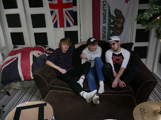
This photo again promotes the idea that the band are relaxed in the interview. This is conveyed through the idea that they have their feet up and are sat back on a sofa. The lead singer on the left is the only member with a direct gaze which implies that the interview will be serious as well as laid back. This photo will also act as a good photo for the double page spread as the photo is a mid/long shot. This means that there is a good amount of room around the photo that I can add text, quotes and secondary photos. However, I do not like the two UK flags on the left of the page. This is because the punk genre has strong links with the USA and rarely combines with the UK. By using these in my mise en scene by accident, the photo unfortunately does not accurately represent the punk genre. Despite this, I still feel that these photos are extremely powerful. 


This photo is in mid shot and from this, the facial expressions of the band are clearer. It is evident that they are happy and the direct gaze addresses the reader as if they are having an informal conversation with the band. I also like how they are evenly lit and framed using the rule of thirds. This photo however shows less of the mise en scene and has less room to add text. Becuase of this, I probably will not use this as the double page spread photo.


This has greater links to the punk genre due to the fact that it is a long shot and there is more mise en scene in shot. I placed a drum kit in front of them in order to further convey the key ideologies of the punk genre as a drum is a key instrument in all bands. The fact the drumsticks are laid down on the snare drum connotes that the band are focusing on other issues in the interview and not just the music. The room is somewhat messy with different props located in different locations. This links to the idea that the genre is crazy and uncontrollable. I feel that the the foreground is well lit but however, the band is not as well lit. This can be corrected using PhotoShop. I also like how they are laughing and pointing towards the camera. This direct gaze and point makes the audience feel as if they are the ones interviewing the band.


I decided against taking the photos in the porch as planned due to the fact that there was not enough space and the mise en scene did not have any reference to the ideologies of the genre.

Sunday, 8 January 2017

FRONT COVER PHOTOS

After the planning of my mast head photos, I was able to go out and take the images for my magazine. I was extremely impressed with how they came out. As planned, I took these photos in the bathroom.


This photo of the band is in portrait. Which is the correct layout for every magazine front cover. I am really pleased with this photo in particular as I feel that it would fit within a punk magazine due to the content it showcases. The clothing is rather extravagant with purple stripes, pink. green, red and other colours all present. The array of colours connotes the idea of the punk genre being controversial and different to mainstream music. The clothes they are wearing are normal clothes like jumpers and baseball caps. As explained by Rob, the person I interviewed, the majority of the punk audience wear casual, mainstream clothes with small links to the stereotypical punk clothing. Examples of stereotypical punk clothing would be the black nails in this example. I feel that the subtle contrast of casual and punk clothing in the mise en scene will have a greater impact on the reader as the chance that they would wear similar clothing, increases. After analysing many punk magazines. The clothing is also similar to what a teenager would wear. This is important as my target audience is around this age. I realised that the photos are all in direct gaze so that the reader feels that they have a connection with the artist. Because of this, I decided to use the idea of direct gaze in my photo. I used fill lighting in the form of a DSLR Speed-light so that the lighting would create subtle shadows. The shadows behind the band could connote the music and the controversial ideologies conveyed through the bad language and controversial lyrics. The use of artificial lighting also has the effect of highlighting the three boys. The fact that the middle member of the band is the lead singer also conforms with the majority of front cover photos as usually, the lead singer is in the middle. The audience will be familiar with this format and understand that the person in the middle is the lead. The photo also has a vignette effect around the borders which frames the band with an orb of shadow and draws the attention to the band members. Another positive of the photo is the fact that there is enough space above them to add the mast head. The only real negative of the photo is the fact that there could be a bit more brightness to make the bright colours of the clothing stand out more. Despite this, it can be easily fixed on an editing software such as PhotoShop. Due to all these factors, I have decided to use this photo as my main front cover image. Here are some other photos I took and I will explain why I didn't choose them.


I decided against choosing this photo due to the weak use of proxemics as the band are too far apart. This means that I can include less content on the front cover as they take up more space and it also connotes that they are not as good friends compared with the other picture. Their facial expressions are also much more serious which denotes that they may be uninterested in the article. This idea of them 'not caring' conforms with the punk stereotype and is common in lots of punk magazines however I feel that in this circumstance, it does not have the same effect as the close-knit, happy band in the picture I chose.


I did not choose this as it is in landscape and the person on the right is not looking directly at the camera. This does not have the same effect as the other photos when they were all using a direct gaze because it seems as if he is uninterested.

Thursday, 5 January 2017

SECONDARY PHOTOS 1

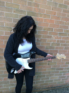
I decided to take some secondary photos to go on my contents page. These photos are going to be attached to a review of the 'new fender electric guitar'. I decided to use a female model as the majority of the punk audience is male. This means that it has the capability to attract the male gaze. The mise en scene of black and white clothing with black hair conveys stereotypical punk clothing and hairstyles. This again will be able to relate to the audience. I also like how the black and white guitar matches the clothing as it further contrasts the bricks behind and emphasising the model. Brick walls are common in punk photo shoots as they commonly portray the street vibe of punk and how it was popular on the streets before it broke out as a popular genre. Altogether, I am extremely pleased with how these pictures turned out.


This picture is  extremely effective due to the fact that she is laughing and smiling. Laughing and smiling show that she is enjoying life which can easily cause the reader to feel the same way. This however does not accurately convey the punk genre as most pictures are with a stern face. Despite this, I feel that this photo is appropriate to be used as she is in full shot along with the guitar and the angle is slanted which conveys the distorted idea of the punk genre compared to mainstream genres.


This photo is not cantered and is a level shot. She also has the guitar at her side instead. Positives of this shot is that she has her foot against the wall which connotes that she laid back and relaxed. The fact that the guitar is by her side is also good as it is more emphasised than the picture above as it does not blend in with her black/grey cardigan. Negatives are that it seems to be so laid back that it has no correlation to the key punk ideologies. The photo seems to have more of a link to the mainstream pop genre due to the angle, composition and facial expressions.


This picture is very similar to the first picture but the major difference is that she is looking down at the guitar and seemingly playing it. This has the effect of drawing the view of the reader to the guitar. However, I do not like the fact that you cannot see the face of the reviewer. This greatly decreases the potential impact of the photo and does not have the greatest connection with the audience.


From the brief analysis, I have chosen the first picture as it conveys a greater majority of punk ideologies.

PHOTO PREPERATION


I have decided to plan the shots I will take for the magazine. I feel that thoroughly planning the photo shoot will optimise the quality of the photos and the capability of drawing the audience in. For the front cover, I have decided to have a full band shot. This shot will be in the bathroom due to the fact that the lighting will highlight the band and the white walls will not take the view away from them. This is crucial in the front cover as all front covers have to convey the content of the magazine and encourage new readers to purchase it. After analysing many front covers, I like the way the band is conveyed in this 'Kerrang!' front cover. 


Due to this, I have decided to position the three members next to each other, in a mid shot with direct gaze at the camera as I feel that this has the best effect in attracting the audience.
For the contents page, I need a few pictures. Some that relate to the articles featured on the front cover and a few for the main cover line promoting the band. I have decided to include pages like reviews on guitars, band tours, interviews and other common things found in a punk magazine contents. Here is an example of a contents page, again from 'Kerrang!' I find most effective. 


Here we can see another picture of the band they focused the front cover on. Due to this, I will probably include another picture of the band. This picture will probably be a picture of them playing. I like the idea of a low angle shot as they are playing as it creates the feeling that the reader is the audience looking up and watching a live band play on stage. Placing this in the contents page will be ideal as the picture will be a mid-shot. For the double page spread, I am considering a longer shot so that I can fit more text in. I also have to include other photos of the other articles as presented in this contents. So I will take a picture of somebody holding an electric guitar and title the article something along the lines of 'GUITAR REVIEW'. This shot will probably be in a slanted, mid shot. The slant to emphasise the guitar and the mid-shot to get the guitar in the full shot. After analysing more magazine contents pages, I have decided to include another picture of a secondary band that I could have interviewed. This band will not be as popular as the band I use as the feature article. I have decided to take a picture of soloist sitting on a chair/ against a wall or standing up. I could title this article 'INTERVIEW WITH *INSERT BAND NAME HERE*' I feel again, a low angle shot will be good here as it has the ability to connote the idea that the soloist is maybe troubled and his thoughts will be featured in the article encouraging the audience to read the article.

Moving on to the double page spread, I have decided to use a single picture as the background. I have also decided to go with a shot of the band laying/standing against a wall. This is because the majority of the people I interviewed chose this image as their preferred pose.


This shot of the band connotes that they are down to earth and in the interview they are relaxed and are honest in what they are saying. I will also use direct contact in this photo again due to the reasons explained in previous blogs. I will probably include secondary pictures on the double page spread that I will take along with the main pictures. I will analyse my photo choices when I upload them to the blog.

Tuesday, 3 January 2017

PHOTO / CONTENT PREP

I am good friends with a member of a band called 'Reminders'. They are based on the Isle of Wight and they focus their music on the punk sub-genre of beach punk. I feel that utilising this for my magazine is vital and due to this, I can spend less time focusing on content and the mise en scene as the band will be able to provide me with the information I need on both of these key concepts within the magazine. It will also make it easier when it comes to collecting instruments as they already have the instruments ready to use. I have told them to wear what they normally do for a concert as the clothes they wear would be casual with some elements of the punk stereotype. The casual part is a key concept surrounding sub-genres like beach and surf punk. Examples of stereotypical clothing are boots and leather jackets.

I have also decided to take the pictures in various locations. The locations have been planned below


Location 1: BATHROOM
I have decided to take the main image in the bathroom due to four reasons. The bathroom along with the other locations are places where they shot their new music video, 'Purple Stripes'. If the reader has seen the music video, they will notice the mise en scene and link the picture to the video. This has the potential to attract new readers to the magazine. The bathroom has a simplistic design. This means that any photos taken will pull the readers view to the band. The white walls will almost act like a blank canvas. Another positive is the fact that the lighting in the bathroom is very good meaning I will not have to use artificial lighting for the photos. A bathroom is also commonly linked to playfulness. I researched that most people associate bathrooms with sexual acts and stupidity. This could be used to my advantage as the reader would link the band to being rather wacky and stupid which is a common representation  of most punk bands. The fact that they are playing a song in a bathroom, evokes the idea of the punk genre being 'unique' and the complete opposite of mainstream.

Location 2: PORCH
In the music video, the next shot is them in the porch. This is why I have chosen to take photos of them in this location. The photos from this location will probably be used in the contents page and the double page spread.

Location 3: SUMMER HOUSE
For the third location, they are going to be gigging inside their summer house. I feel that this setting will accurately portray the genre of beach punk due to the summer theme.

Now I have finished planning the photos, I can take them and decide which ones I will use in the magazine.