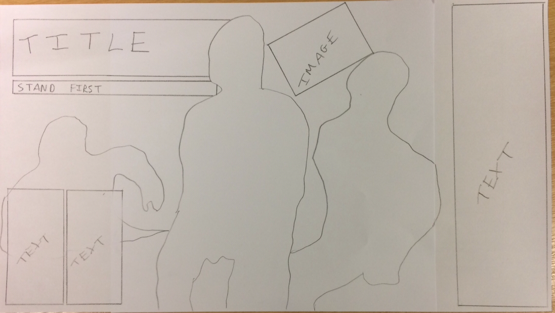
For my double page spread, I decided to keep the overall concept simple. This is because I want to emphasise the structure of the photo. From my primary research, I discovered that the majority of the people prefered the simplistic design so this is another reason why I opted for this approach. I really like the placement of the text as I am considering to include any additional information in the two smaller text boxes and I will feature the Q&A in the larger text box to the side. Whilst sketching the double page spread plan, I realised that I need more space to add text. Therefore, I have decided to merge the right hand side of the photo with a white background to create more space. I have decided to place the title of the article behind the lead member of the band due to the fact that I want to emphasise his presence. This also makes the reader feel more involved in the article as the lead singer is almost jumping out the page. I decided to place a secondary image on the page as I feel that this will add more colour and contrast the colour of the text. I have also decided to add a stand first under the title. This is because, from research I discovered that this is common in most articles. It is used to encourage the reader to read the article and summarises it in a sentence. I feel that there are negatives of this design. I feel that the overall structure of the double page spread is heavily influenced from my reasearch and planning. From analysing many different double page spreads, I noticed that the title usually was placed in the top left hand side. This is why I chose to place it here. Due to the fact that I want to use the whole picture, there will be problems in placing text and images without covering the band members. I also feel that the design could be too simplistic. This is mainly because most punk magazines are the complete opposite of simple and have lots of different images, fonts and structures to connote the uncontrollable nature of the music. Due to this, I will probably add extra small things in PhotoShop if I feel that it is necessary. However, I like how the simplistic design contrasts the front cover and contents page as it makes the interview seem more informal and relaxed.
However, after looking back at my plan, I realised that I accidentally forgot to include page numbers which are a necessity on any page. So when it comes to the production of the double page spread, I will make sure to include these in the corners in order to make them have less prominence on the page and so that the page follows the forms and conventions of any magazine.
After all my planning, I can now begin my production of the magazine on PhotoShop.
No comments:
Post a Comment